Theming
Theming can be done by editing the CSS variables in the base stylesheet, or if you install a theme plugin
CSS Variables
@webtui/css ships with a set of CSS variables that control font styles and background/foreground colors
These can be customized with the CSS :root selector on the base layer
@layer base {
    :root {
        --font-size: 18px;
        --font-family: "JetBrainsMono", monospace;
    }
}
Font Styles
@layer base {
    :root {
        --font-size: 16px;
        --line-height: 1.3;
        /* Font weight for bold text */
        --font-weight-bold: 700;
        /* Font weight for regular text */
        --font-weight-normal: 400;
        --font-family: monospace;
    }
}
Colors
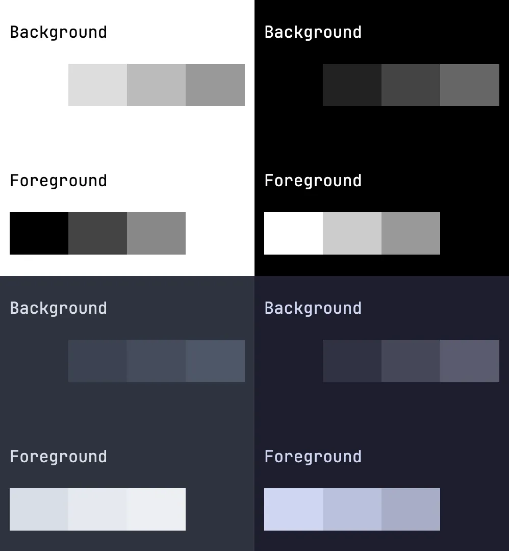
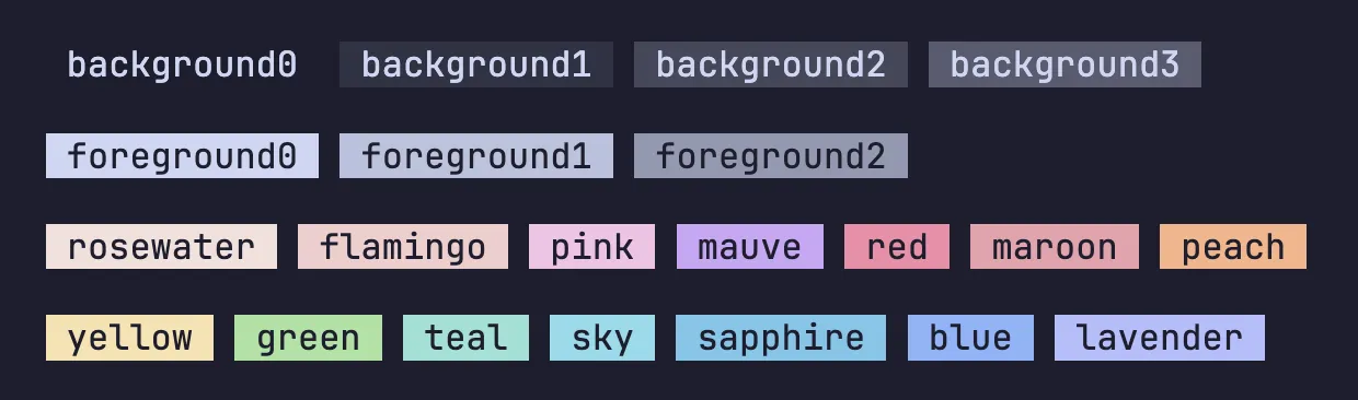
The base theme consists of four background levels and three foreground levels
Additional color accents/variants can be added to components individually with CSS or by importing a theme plugin
@layer base {
    :root {
        /* Default background color */
        --background0: #fff;
        /* Background levels 1-3 */
        --background1: #ddd;
        --background2: #bbb;
        --background3: #999;

        /* Default foreground color */
        --foreground0: #000;
        /* Foreground levels 1-2 */
        --foreground1: #444;
        --foreground2: #888;
    }
}
Shown below is a screenshot showing the background and foreground colors of a basic light theme, dark theme, Nord, and Catppuccin
Light & Dark
@webtui/css ships with a very basic black-and-white theme that automatically changes based on the user’s color preference
The user’s preferred color scheme can be respected with the prefers-color-scheme media query
@layer base {
    @media(prefers-color-scheme: dark) {
        :root {
            --background0: #000;
            /* ... */
        }
    }
}
A class can be used on the html element if you intend to change the color scheme dynamically with JavaScript
<html class="dark">
    <head>
        <style>
            @layer base {
                html.dark {
                    --background0: #000;
                    /* ... */
                }
            }
        </style>
    </head>
<!-- ... -->
</html>
Theme Plugins
Theme plugins include additional color variants for individual components on top of changing the base colors
Check out the Plugins page for a list of available themes