Button
Import
@import "@webtui/css/components/button.css";The Box Utility can be used to add box borders to buttons
@import "@webtui/css/utils/box.css";Usage
Create a <button> element, or add is-="button" to any HTML element
<button>Normal button</button>
<div is-="button">Div Button</div>
box-
Use the box- attribute to add a box border a button (requires the box utility)
<button box-="round">Round</button>
<button box-="square">Square</button>
<button box-="double">Double</button>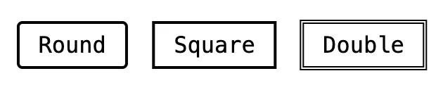
variant-
Use the variant- attribute to change the color of a button
Available variants match the base theme colors
<button variant-="background0"></button>
<button variant-="background1"></button>
<button variant-="background2"></button>
<button variant-="background3"></button>
<button variant-="foreground0"></button>
<button variant-="foreground1"></button>
<button variant-="foreground2"></button>
size-
Use the size- attribute to change the size of a button
<button>Default</button>
<button size-="small">Small</button>
disabled
Use the disabled attribute to mark a button as disabled
<button disabled>Disabled</button>Styling
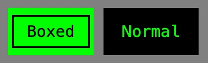
Buttons are styled using the custom --button-primary and --button-secondary CSS properties
button {
    --button-primary: black;
    --button-secondary: green;
}
Buttons automatically switch between --button-primary and --button-secondary based on whether box- is applied or not
Extending
To extend the Button stylesheet, define a CSS rule on the components layer
@layer components {
    button, [is-~="button"] {
        &[variant-="red"] {
            --button-primary: red;
            --button-secondary: white;
        }

        /* ... */
    }
}
Scope
button, [is-~="button"] { /* ... */ }